Wednesday, April 15, 2015

Marianne Brandt

        Marianne Brandt was a student at the Bauhaus school from 1923 to 1929. Before she 

attended the Bauhaus school, she was previously trained as a painter and practiced with 

her husband, Erik Brandt, who was a painter himself. While at the Bauhaus, she studied 

photography, sculpture, design and painting. She had many talents in all fields of the arts, 

but turned her attention towards design. More specifically, design that involved metal. She 

was the head of the metal workshop group and created some things and ideas that we still 

take into account today. These include lamps, teapots and ashtrays. Out of these, the 

metal ashtrays are probably the creation she is most known for. 

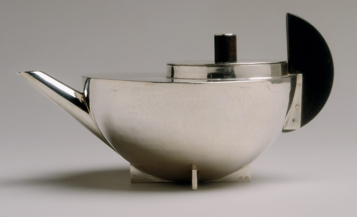
Metal Teapot - Marianne Brandt
Metal Ashtray - Marianne Brandt

       After leaving the Bauhaus school, Marianne worked in a studio in Berlin for Walter 

Gropius. Walter was the founder of the Bauhaus school, so it seems like it would be an 

honor to work for the founder just after attending. Anyways, she had multiple jobs thought 

her career until the financial depression in 1932. She tried to look for work outside of 

Germany, but due to family and friends she had to return. The most interesting fact about 

Marianne might be when she became an official member of the Nazi artists organization in 

1939. The reason behind this decision was just to gain access to art supplies that would 

otherwise not be available to her. So, she was not in favor of the Nazi's, but did what she 

had to do for work. She passed away at the age of 89, but she had many students that 

looked up to her and learned from her, which resulted in them following in her footsteps 

(metal design).    

Marianne Brandt (unknown photographer)

The McDonalds Logo

        McDonalds has become one of the most successful food establishments to date. 

They can be found all over the globe with their different menu variations in order to meet 

the standards for the specific culture. Since you can find a McDonalds almost anywhere 

you go, they must be doing something right in order to have the funds to be everywhere at 

once. People have many different reasons why they believe that it has become so 

successful, ranging from the food prices to the appearance of the restaurants. A reason 

that doesn't get all of the credit that it deserves is the logo! 

        McDonalds didn't always have the two golden arches that shape the letter 'M' as we 

know today. It actually started out as a barbecue restaurant in the year 1940, which is also 

when they had their first logo. From the look of this logo, it seems boring and bland due to 

the amount of text on it, but keep in mind it was just the beginning of something great. 

1940 McDonalds Logo

        The logo changed for the first time in the year 1948 to a shift in the product they were 

selling. The word "barbecue" was swapped out for "hamburgers" and this really paved the 

road to success. Five years later, the logo changed again to a more picture based one. This 

one had some sort of a hamburger bun man with text around him. At this time, McDonalds 

was growing in popularity, but they were still small burger stands. 

1948 Mcdonalds Logo
        In 1960, the owners discovered that if their burger stands were seen at an angle, the 

arches on both sides of the place met together and created the letter 'M'. With this, the 

logo was changed once again, but closer to what we know the logo to be today. The name 

"McDonalds" was purposefully placed into to logo so that it wouldn't be confused with any 

other logo that might have the letter 'M'.   

1960 McDonalds Logo
       As time went on, the McDonalds logo was just cleaned up to make it look more 

professional. The two arches didn't cross each other, but met in the middle, the circle 

around the logo was removed and eventually the name was taken out. The logo, name and 

product was already stuck in everyone's mind, so the name was no longer needed on the 

logo. 

1968 McDonalds Logo
1995 McDonalds Logo

Now McDonalds Logo

     Most of the time, the logos with a single word or a single image are the ones that are the 

most memorable, which helps because the people who remember it will tell others and so 

on. The more people that know about it, the more business it will receive. As for the yellow 

and red colors, they signify energy, power, happiness and many other things on their own, 

but when put together, it makes people get hungry for one reason or another.   

Wednesday, April 8, 2015

Saul Bass

        Saul Bass was yet another great and inspirational graphic designer. Bass was heavily 

influenced by Rand’s work, especially when it came to shape and asymmetrical designs. 

Though Bass loved the work produced by Rand, his own work differed because Bass 

usually focused on a main subject. In other words, something in the design was very strong 

and prominent, while everything else is not as dominating. 

Similar to Paul Rand, Saul Bass was gifted at multiple things when it came to design. 

Apart from that, Bass is probably best known for his film posters and title screens. Over his 

years working as a graphic designer and filmmaker, he was able to work with some of the 

most popular filmmakers. These people included Hitchcock, Kubrick, Wilder and a few 

others. Whenever I think of Saul Bass, my mind also travels to Alfred Hitchcock and for 

good reason. It was within Hitchcock’s films Vertigo and psycho when Bass created a new 

type of “kinetic typography.” This opened up new possibilities when it came to title 

sequences and just challenged how far the norm could be pushed. 

"Vertigo"
"The Man With The Golden Arm"

Another thing these two had in common was the creation of corporate logos during 

their career. Bass might not have created as many as Rand, but he did make some that are 

still around today. These include the AT&T Bell as well as the Globe logo and the United 

Airlines logo. 

Saul Bass and Logo

Paul Rand

  Born in Brooklyn, New York in the year 1914, Paul Rand was exposed to art at a very 

young age. He would have to create signs, posters and various other items to try to attract 

more people to his father’s grocery store. He would also do projects like this for the school 

he attended. Rand was basically a self taught designer due to the fact that he attended 

schools, which taught him skills for different career paths. He never went to schools where 

is creative mind could wonder because his father did not believe that his son could make a 

living creating designs. 

Although Paul Rand is mostly known for his design of corporate logos, he did take 

certain steps to get there. In his earlier years, he would supply stock images for magazines 

and newspapers. He then moved on to designing front covers of magazines with full 

creativity and freedom, which ultimately lead to taking the place as art director for the 

Esquire magazine. This was a huge accomplishment within his career, but he was not 

finished yet. 

Eye-Bee-M (IBM) - Paul Rand

ABC - Paul Rand


Later on, Rand created some of the most successful company logos to date. To name 

a few that he designed: UPS, IBM, ABC, Westinghouse and many others. Within all of 

designs, Paul always demonstrated that a design does not have to be original in order to 

be exciting. Before his death in 1996, most people considered Rand to be “the greatest 

living graphic designer.” 

Paul Rand

Saturday, April 4, 2015

Futurism

        When thinking about the many art movements, Futurism is one that captures my 

attention the most. The Futurism art movement was all about experimenting with any and 

all elements of design. The experiments lead to many new forms of design that are still 

used today, which is why I find it so fascinating. 

  Futurism was when the unwritten laws of design were cast away in order to create a 

free environment for artists. This free environment that was created gave artists the 

confidence to try something new and see how far it would go. In some cases, this 

movement lead to so many new ideas, that it was now known that creating design could 

not be limited by rules or laws. The former ways of layout for text and shapes were thought 

to be horizontal and vertical, but nothing more. The breakthrough during this time was 

slanted, diagonal, zigzag, and overall crazy directions for the design to take. Placement, 

size and shape were also played around with in order to obtain the idea or effect of 

movement. Showing movement was huge and is often what this movement is known for. 

When a design makes your eye travel across the page, that design becomes extremely 

effective because it makes your attention go to the exact point the artist wants it to be. 

Interventionist Manifesto - Carlo Carrà
Sea = Dancer - Gino Severini
Unique Forms of Continuity in Space - Umberto Boccioni


  Futurism wasn’t only for artists, but for writers as well (poets mostly). Poets used this 

to make their text travel, or even be spaced out in such a way, that the way in which the 

text is displayed relates to the message of the poem. Not only is it an eye catching way to 

present the work, but it also helps the reader understand the point of the poem.

Graphic Artists

        Edward Penfield and Louis Rhead were both illustrator artists during the same time. 

Edward was born in America and Louis emigrated to America and married an American 

woman, making him a citizen. They both did the same type of work, but had fairly different 

styles when it came to their illustrations. 

Edward Penfield is often considered to be the father of the American Poster. His 

Posters were bold and stood out from others, especially from a distance. He used simple 

shapes, as well as a limited pallet of colors. It seems like using these materials and 

methods, the artwork would become stale over time, but this became his own unique style. 

Louis Rhead was also known for his poster art, but not as widely known as Penfield. 

He started off creating posters in England and then transferred to creating them in the U.S. 

His posters consisted of mostly people that would usually be looking at the viewer. He 

used finer lines and possibly some more color when compared to Penfield. 


Both of these artists had their work displayed within books as well as galleries. As the 

decline in poster art began, Rhead started to focus on writing books (especially about 

fishing), while Penfield just kept making illustrations. 


Edward Penfield - Harper's February


Edward Penfield - Harper's May


Louis Rhead - The Quarter Latin


The Genesis of the Twentieth-Century

        When thinking about the origin of Twentieth-Century design, I am usually drawn to the 

London Underground design. I am drawn towards it because of the significance of the 

development of the logo. The Underground logo is important to this time because of a 

variety of reasons, including the three popular questions of why it was made, how it was  

made, and what it was made for. 

A man named Frank Pick was the one who started it all, by having and providing his 

vision to the Underground Group. Frank was not a person that came from a background of 

art, or even someone who studied it. Even though he didn’t have any type of training when 

it came to art, he developed a passion for design while working as an attorney for a firm 

that had design programs. With this passion, he took the Underground project very 

seriously to the point where he personally selected artists to create the designs required. 

Just because he had hand picked his artists, it didn’t mean that all of their work would 

be accepted. He would turn down work that weren’t up to par, but also promote those that 

were. The artists were given little direction, such as the theme, but not much else. So, who 

would expect all the work to be great when they hardly know what they are supposed to 

make? The work that he turned down the most was when it dealt with type. Frank was very 

displeased with the typography of the Underground, so he commissioned Edward 

Johnston, a calligrapher, to design a “one-of-a-kind” typeface for the Underground. 


After going through a few versions of the typeface, one was decided upon. This is the 

same type that is still used today. It is bold, simple and consistent with line weight from 

letter to letter. After creating the font, Edward also designed a new version of the 

Underground logo, while introducing the new type. The fact that it is still around today 

proves that the Underground logo is a strong design that originated in the Twentieth-

Century.  


Underground Blueprints


Underground Finished


Wednesday, March 4, 2015

Arts during Industrial Revolution

     After reading about what happened to the arts during both the American and French 

Industrial Revolutions, I was struck by how many things were taking place at the same 

time. Just to name some things, the new materials of iron and steel became available for 

use, new typography styles were created as well as type size, and photography was 

invented. There are plenty other things that took place during this time, but these are just 

some of the things that really caught my attention while reading about this time. 

     Whenever something new comes out or is available for the public, people rush to it in 

order to discover new things. So since people still do this today, I’m sure that it would have 

been very exciting to discover new materials to create a piece of art with during that time, 

so the availability of iron and steel must have been a huge boost for artists. They probably 

all wanted to see what the new materials were like and play around with each one for a 

while in order to see what they could create as well as discover if they like the new 

materials overall.  

     When it come to typography and its different styles, today there are what seems to be 

an unlimited supply of them that range up and down the spectrum from good to bad. Back 

then during the Industrial Revolutions, there couldn’t have been that many because they 

were all designed by hand followed by being put into letterpress printers in order to create 

books and other items. One letter at a time with no possible short cuts sounds like a pretty 

tough task. So, after the invention of the lithographic printers, the production of new 

typefaces and size shot up in numbers. Since the lithographic printers allowed imagination 

to become printed from the process of an artists sketch becoming a rendered plate. Not 

only could it print type, but also images that artist would sketch out, making this a huge 

jump for graphic design. 


     Last, but not least, the invention of photography. The field of art that I love the most was 

invented as well as a whole new world to experience. As stated in the book, photography 

“expanded the meaning of visual documentation and pictorial information.” This tells us 

that due to this new way to capture a moment in time and keep it for as long as the printed 

version lives, a new way to create art was born. Even though it started out as a longer 

waiting process than what we are used to now, it was still a break through for the world of 

art.

Tuesday, February 10, 2015

Renaissance and Now

After reading about the graphic design that appeared in the Renaissance era, I started

to think about art as a whole during that timeframe. Personally, I believe that the 

Renaissance was the peak of art in terms of popularity and importance. When comparing 

that to art in today’s society, it’s the complete opposite. It is so interesting to see how much 

has changed in the art world as time passed by.

From the readings, it seems as though back during the Renaissance, art was not only 

flourishing, but also welcomed, appreciated and valued. It seems like there was no 

question that art was important. By saying art, I mean the “play” aspect of it. Without 

“play,” how can an individual be allowed to express creativity? Pablo Picasso once said 

“All children are artists, the problem is staying an artist when you grow up.” I heavily 

believe in this quote because of how true it is to me. When we were all children, we had an 

unlimited amount of free time. With this free time we would play for hours and hours 

possibly creating art masterpieces in the process. As we grow up, we start to gain 

responsibilities which then occupy the free time that we once had. Without this free time 

anymore, we cannot play as much as we used to. Aside from that, we have parents and 

other older figures that tell us things like “stop playing around” and “if you’re not sweating, 

then you’re not working.” With all of this mixed together, it is very hard to stay in touch with 

our childish and playful side that we all still have, but have lost a portion of along the way.


                                                                       Initials


Nowadays, schools and jobs tend to lean towards what is know as STEM, or science, 

technology, engineering and math. As someone who loves all forms of art, this is very 

disappointing to know. People just don’t seem to think that art is important for some 

reason. I am convinced that it is just due to the time that we live in, and eventually the arts 

will nudge its way back into society’s hearts and minds.


                                                                            Hello Typography