They can be found all over the globe with their different menu variations in order to meet
the standards for the specific culture. Since you can find a McDonalds almost anywhere
you go, they must be doing something right in order to have the funds to be everywhere at
once. People have many different reasons why they believe that it has become so
successful, ranging from the food prices to the appearance of the restaurants. A reason
that doesn't get all of the credit that it deserves is the logo!
McDonalds didn't always have the two golden arches that shape the letter 'M' as we
know today. It actually started out as a barbecue restaurant in the year 1940, which is also
when they had their first logo. From the look of this logo, it seems boring and bland due to
the amount of text on it, but keep in mind it was just the beginning of something great.
| 1940 McDonalds Logo |
The logo changed for the first time in the year 1948 to a shift in the product they were
selling. The word "barbecue" was swapped out for "hamburgers" and this really paved the
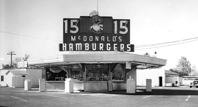
road to success. Five years later, the logo changed again to a more picture based one. This
one had some sort of a hamburger bun man with text around him. At this time, McDonalds
was growing in popularity, but they were still small burger stands.
 |
| 1948 Mcdonalds Logo |
arches on both sides of the place met together and created the letter 'M'. With this, the
logo was changed once again, but closer to what we know the logo to be today. The name
"McDonalds" was purposefully placed into to logo so that it wouldn't be confused with any
other logo that might have the letter 'M'.
 |
| 1960 McDonalds Logo |
professional. The two arches didn't cross each other, but met in the middle, the circle
around the logo was removed and eventually the name was taken out. The logo, name and
product was already stuck in everyone's mind, so the name was no longer needed on the
logo.
| 1968 McDonalds Logo |
| 1995 McDonalds Logo |
| Now McDonalds Logo |
Most of the time, the logos with a single word or a single image are the ones that are the
most memorable, which helps because the people who remember it will tell others and so
on. The more people that know about it, the more business it will receive. As for the yellow
and red colors, they signify energy, power, happiness and many other things on their own,
but when put together, it makes people get hungry for one reason or another.
No comments:
Post a Comment