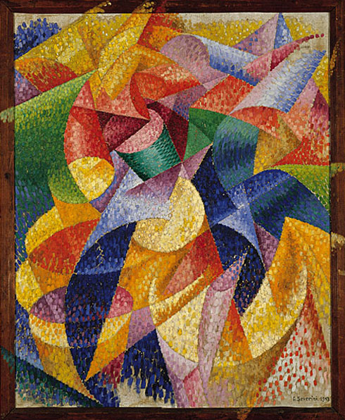
When thinking about the many art movements, Futurism is one that captures my
attention the most. The Futurism art movement was all about experimenting with any and
all elements of design. The experiments lead to many new forms of design that are still
used today, which is why I find it so fascinating.
Futurism was when the unwritten laws of design were cast away in order to create a
free environment for artists. This free environment that was created gave artists the
confidence to try something new and see how far it would go. In some cases, this
movement lead to so many new ideas, that it was now known that creating design could
not be limited by rules or laws. The former ways of layout for text and shapes were thought
to be horizontal and vertical, but nothing more. The breakthrough during this time was
slanted, diagonal, zigzag, and overall crazy directions for the design to take. Placement,
size and shape were also played around with in order to obtain the idea or effect of
movement. Showing movement was huge and is often what this movement is known for.
When a design makes your eye travel across the page, that design becomes extremely
effective because it makes your attention go to the exact point the artist wants it to be.
 |
| Interventionist Manifesto - Carlo Carrà |
 |
| Sea = Dancer - Gino Severini |
 |
| Unique Forms of Continuity in Space - Umberto Boccioni |
Futurism wasn’t only for artists, but for writers as well (poets mostly). Poets used this
to make their text travel, or even be spaced out in such a way, that the way in which the
text is displayed relates to the message of the poem. Not only is it an eye catching way to
present the work, but it also helps the reader understand the point of the poem.
No comments:
Post a Comment