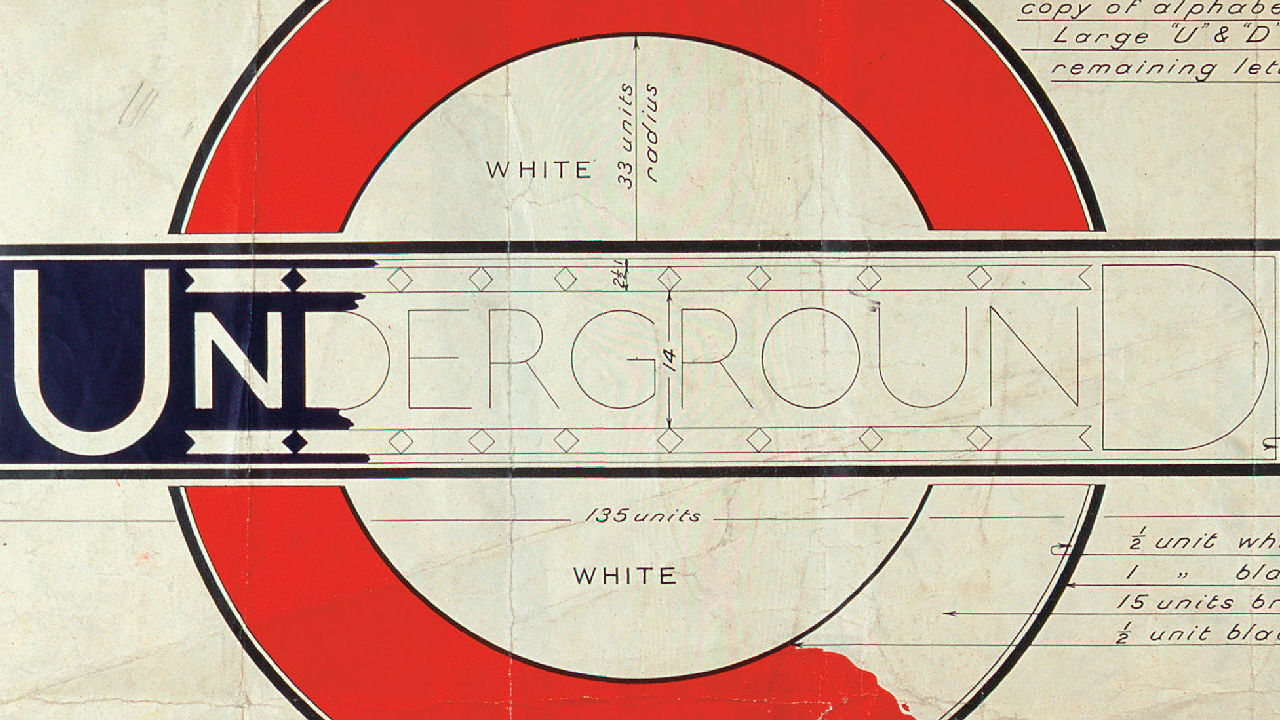
When thinking about the origin of Twentieth-Century design, I am usually drawn to the
London Underground design. I am drawn towards it because of the significance of the
development of the logo. The Underground logo is important to this time because of a
variety of reasons, including the three popular questions of why it was made, how it was
made, and what it was made for.
A man named Frank Pick was the one who started it all, by having and providing his
vision to the Underground Group. Frank was not a person that came from a background of
art, or even someone who studied it. Even though he didn’t have any type of training when
it came to art, he developed a passion for design while working as an attorney for a firm
that had design programs. With this passion, he took the Underground project very
seriously to the point where he personally selected artists to create the designs required.
Just because he had hand picked his artists, it didn’t mean that all of their work would
be accepted. He would turn down work that weren’t up to par, but also promote those that
were. The artists were given little direction, such as the theme, but not much else. So, who
would expect all the work to be great when they hardly know what they are supposed to
make? The work that he turned down the most was when it dealt with type. Frank was very
displeased with the typography of the Underground, so he commissioned Edward
Johnston, a calligrapher, to design a “one-of-a-kind” typeface for the Underground.
After going through a few versions of the typeface, one was decided upon. This is the
same type that is still used today. It is bold, simple and consistent with line weight from
letter to letter. After creating the font, Edward also designed a new version of the
Underground logo, while introducing the new type. The fact that it is still around today
proves that the Underground logo is a strong design that originated in the Twentieth-
Century.
Underground Blueprints
Underground Finished


No comments:
Post a Comment