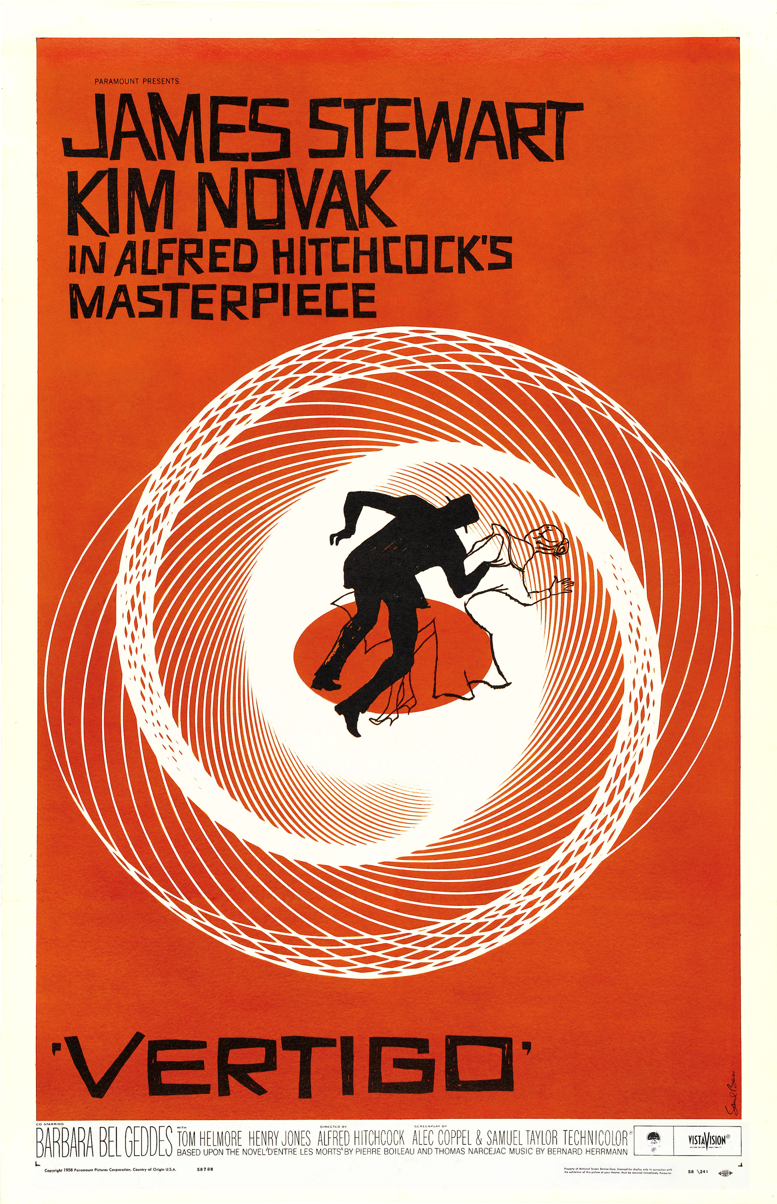
Saul Bass was yet another great and inspirational graphic designer. Bass was heavily
influenced by Rand’s work, especially when it came to shape and asymmetrical designs.
Though Bass loved the work produced by Rand, his own work differed because Bass
usually focused on a main subject. In other words, something in the design was very strong
and prominent, while everything else is not as dominating.
Similar to Paul Rand, Saul Bass was gifted at multiple things when it came to design.
Apart from that, Bass is probably best known for his film posters and title screens. Over his
years working as a graphic designer and filmmaker, he was able to work with some of the
most popular filmmakers. These people included Hitchcock, Kubrick, Wilder and a few
others. Whenever I think of Saul Bass, my mind also travels to Alfred Hitchcock and for
good reason. It was within Hitchcock’s films Vertigo and psycho when Bass created a new
type of “kinetic typography.” This opened up new possibilities when it came to title
sequences and just challenged how far the norm could be pushed.
 |
| "Vertigo" |
Another thing these two had in common was the creation of corporate logos during
their career. Bass might not have created as many as Rand, but he did make some that are
still around today. These include the AT&T Bell as well as the Globe logo and the United


No comments:
Post a Comment